

 Randy Rayess
Did you know that 68 percent users leave a site if it is designed poorly? The ease of use of a website has a dramatic influence on people’s first impression of your brand. Designers are now evolving their methodologies and increasingly adopting responsive web design practices to deliver a seamless experience across multiple devices and browsers.
Here are five essentials of designing websites that can provide great user experience across various screen sizes.
It’s All About the Users
Responsive Web Design (RWD) experiences vary according to the access devices. A desktop experience doesn’t involve playing around with a webpage’s corners or designing the content to shift according to the size of the window. However, if the page has non-obvious links or is taking ages to load, get ready for plummeting page views from your desktop audience.
In simpler terms, RWD isn’t limited to the mobile only. Desktops, tablets and other unconventional devices are also delivering your content to users. That’s why it’s very important to design for the user and not for the device.
Identify your users and create personas. This improves your designing ability to suit a particular set of end users.
A persona is a virtual personality sketch of your users designed based on the inputs you have from them. It helps you in determining how they will be using your site. For instance, a study revealed that 86 percent are more likely to use mobile devices to prepare for or help them during shopping trips than dads (84 percent). Revelations like these help you understand consumer behaviour, telling you how and why they access content and enable you to come up with design considerations which best suit them. You can find various reports related to user personas over the web. Here’s one example:
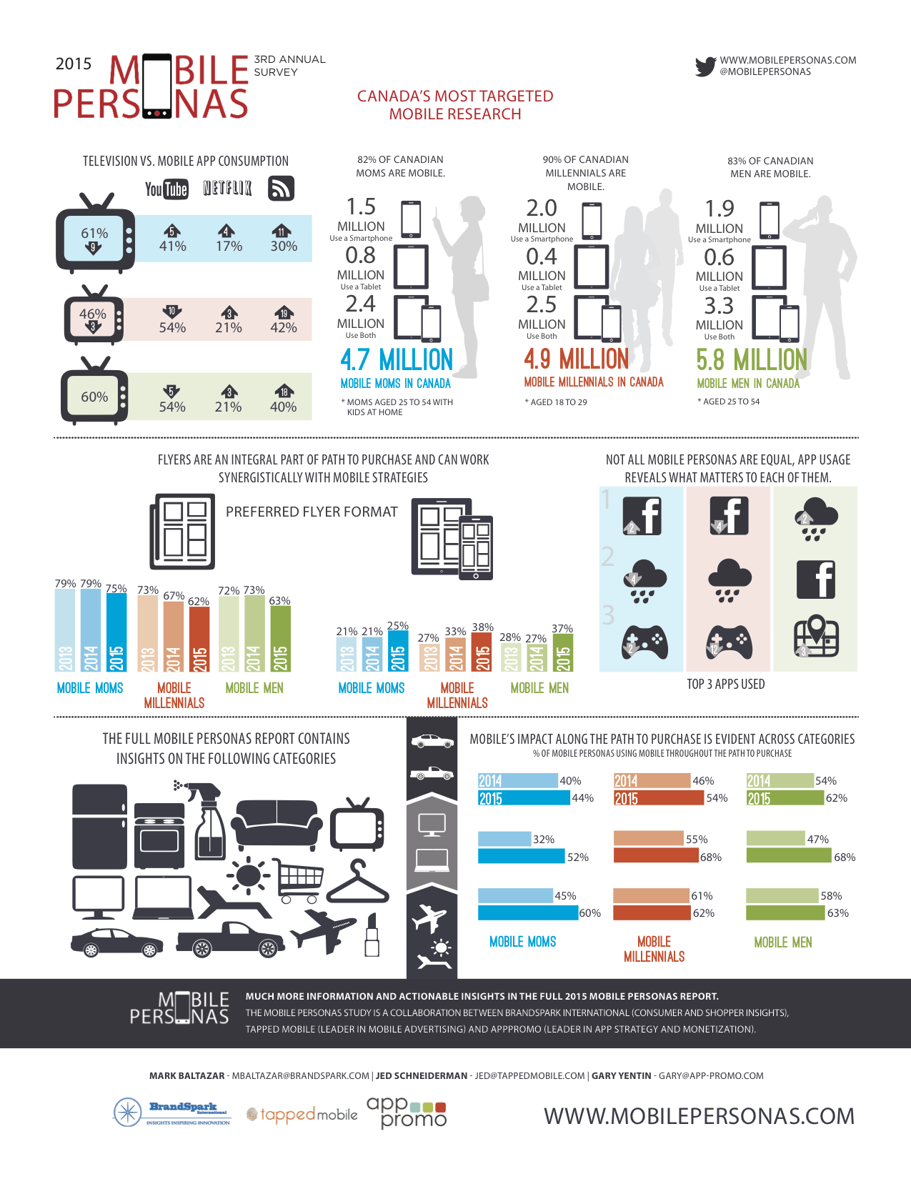
The internal team at BBC identified various user personas and made them an integral part of their mobile strategy.

Next, consider the context or environment in which they’ll be using the site. Josh Clark lists down three probable mobile users’ mindsets in his book Tapworthy – Designing Great iPhone Apps
- Microtasking: Using the phone for short bursts of activity.
- Local : Finding out what’s around the user.
- Bored : Using the phone for distraction/entertainment.
Once you have a definitive image of your users in mind, back it up with industry and market trends from comScore, eMarketer, Forrester and Nielsen.
Adapt a Mobile-first Approach
The concept of usability becomes more complex as you consider the different screen sizes you need to design for. Users also expect sites to resize according to the orientation of the device screen. Sure, smartphone browsers have become smart enough to automatically identify and deliver mini-versions of desktop websites, but they don’t do any good to user experience, forcing users to zoom in and zoom out. This inadvertently distracts them from the content.

Progressive Enhancement
To ensure that users face minimum attention loss while using your site irrespective of the device, Luke W advocates for a mobile-first principle. Which means a designer must first design for mobile devices, wand then later scale the site up to suit desktop requirements. This is often known as progressive enhancement.


Bootstrap 3, Foundation by Zurb, Yiibu.com and Sleepstreet.be, all followed a mobile-first approach to become responsive to all mobile devices.

Navigation is the Key
Simple navigation is the heart of a good design. While desktop users navigate with a mouse and cursor,mobile users rely on small keypads and touch to navigate through mobile sites. While designing for latter you will also face the challenge of working with tiny real estate along with the need to help users complete navigation tasks quickly and efficiently. Therefore, while you’re at it, keep a few do’s and don’ts in mind.
|
Do’s |
Don’ts |
|
Scrolling Navigation |
Keep more than five menu options |
|
Use a nested menu to present more menu options |
Make the users click or tap too much |
|
Provide access key shortcuts |
Design for landscape; users see your site vertically |
| Link to the desktop Site, in case user wants to see that version | Opt for tall and thin navigation; wide short nav works best in mobile |
| Keep a tap size of at least 44 pixels |
Use different typography/images for mobile; maintain consistency |

Pro Tip: Want to learn about navigation in responsive web design? Refer to this detailed guide.
Design for Touch
Designing for touch is a lot more than just accommodating the page as per a screen size. It also means making way for fingers and thumbs, accommodating for clumsy taps. You don’t only need to focus on how the pixels look but also on how they feel. It means being thoughtfully aware of how users interact with their devices.
First , pay attention to where the fingers rest on a mobile device. If you haven’t already noticed, most users tap on their mobile phones using their thumbs. Basically, designing for touch means designing for thumb. Place primary links or content in the bottom third of the screen, on the opposite side of a thumb. In fact, irrespective of which hand the user uses, the primary tap targets should always lie at the bottom.
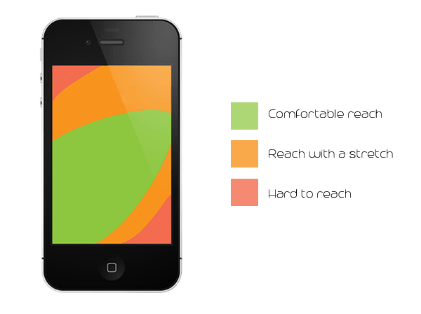
Touch Heatmap for Mobile Devices
Second, avoid stacking website navigation to the screen bottom since different browsers have their own buttons and controls which can lead to UI conflicts. This means your site’s toolbar might stack on top of a browser toolbar. To combat this challenge, follow a simple rule – content on top, controls at bottom. The idea is to give users relevant content prima facie and shift the web navigation to the bottom of the entire page, so that users can easily tap through them to explore further.

Tap Targets
It’s also important not to make the tap targets too big to fail. A minimum of 48 pixels wide or tall tap target works best for the web. But size isn’t the only problem, you need to think about design space as well. Moving the tap targets closer to each other might seem like an easy way out. But remember, increasing proximity of buttons will work directly proportional to an increase in their size.This shouldn’t deter the ease of clicking.
Conduct Usability Test
You don’t want your users leaving because a link wasn’t placed more obviously or they had to tap too many times to go to a page. Therefore, it makes sense to test your site thoroughly. You’ll find plenty of tools online which help you find out what your site looks like on different devices. Dimensions Toolkit is a tool designed by designers for designers. It lets you see how your website is viewed across different devices like iPhone 4 and 5, Samsung Galaxy S, HTC One and Desire, all iPad versions, and Kindle. But the best part of the tool is that it’s compatible with all JavaScript auto-refreshers. Besides this, there are many other tools to choose from like Responsinator, ResponsiveTest etc.
While opting for responsive design for your website is a good idea, you must take caution when dealing with usability. Take ample time to figure out how users will interact with your site, keeping in mind elements like navigation, content and the overall experience. Remember, people won’t think about whether you use the latest technologies or not, all they would want is an unparalleled experience.
